Samsung
Samsung Retail Mode Experience
This was an interesting project with a unique business case. Due to the pandemic the parent company Samsung wanted to provide an immersive shopping experience that would help customers learn about the phone without picking up the device in store. Replacing the experience of picking up a physical phone with a digital equivalent was nearly impossible, but we had to try.
Data driven design
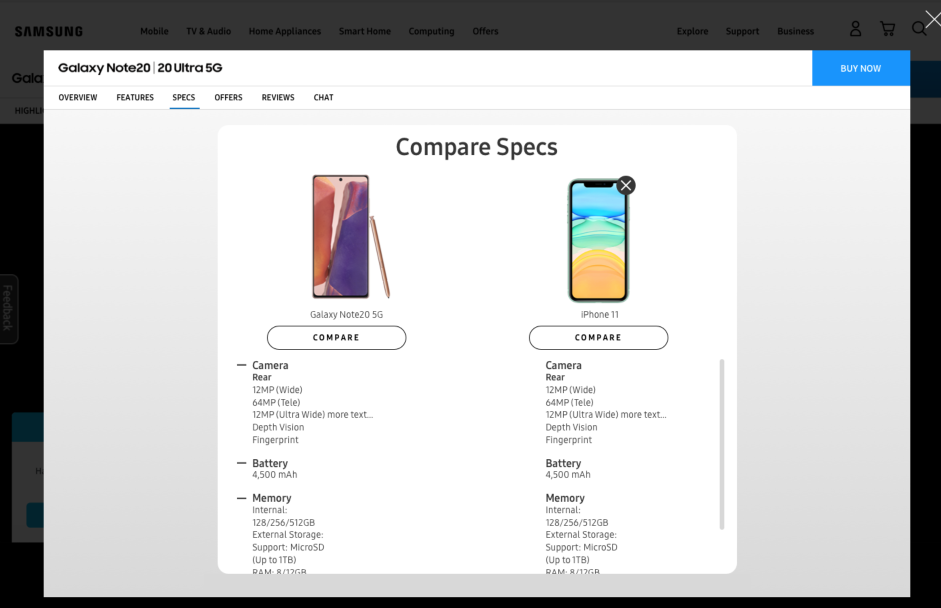
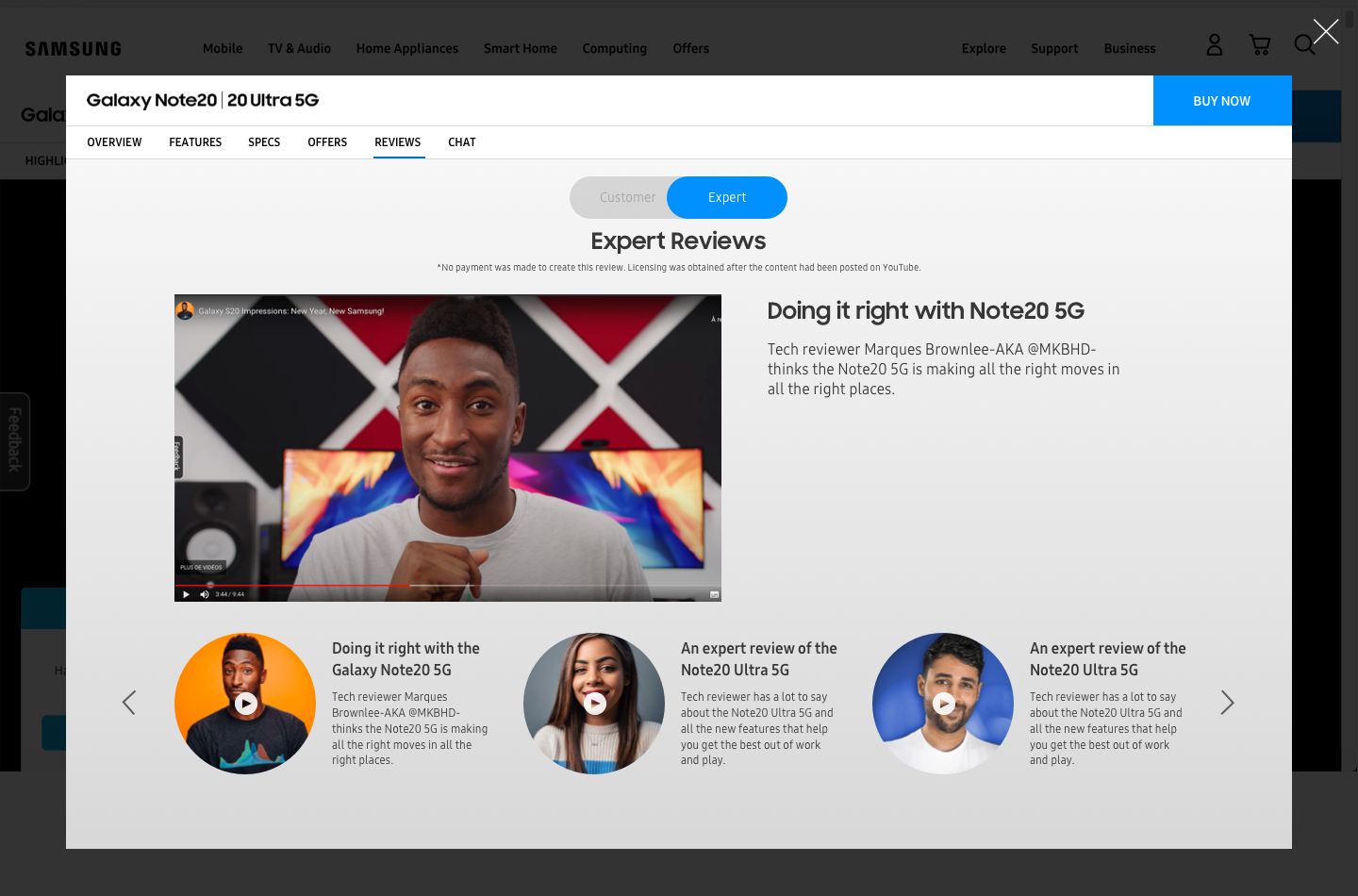
The unique partnership between the Samsung.com and retail teams allowed me access to even more data to drive design decisions. We knew which were the most important elements to focus on in our immersive experience. The majority of traffic from existing experiences were surrounding features, specs and reviews. Through conversations with customers we discovered that even though they didn’t understand the specs details, they preferred to see them and have a device comparison in order to make their decisions.
Mobile first
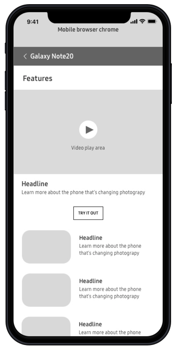
A true mobile first experience we focused on what the customers would view if they scanned a QR code in store. This experience was then made responsive for desktop and has applications beyond the retail space. We’ve explored how it might benefit the shopping experience on partner sites as well as .com
Strategy & Problem Solving
We needed a way to make a flexible framework for future launches while meeting the expectations and feature set for the upcoming launch under a tight deadline. I proposed a themed entry point (homepage) for the experience which would include tiles for the top features of the product. I provided alternate layouts for if the product had less or more key feature sets. I provided a link to the interactive quiz which was an embedded experience from headquarters and provided an alternative for launches with no quiz.
Collaborating with Engineering and Business Partners
Business partners were present throughout the design and development process and I would present my work and groom any technical aspects with the business and developers multiple times per week. I worked with the engineers to ensure that when the feature tiles would open the video would auto play (when possible) but also allow for some video controls of scrubbing and skipping if the video was longer than 30 seconds. We used an alternative video source for long videos in order to ensure fast load times and buffering which I advocated for in the UX requirements.
Agile + SPEED
This process was truly agile because we had such little time to roll our our first device launch. The first device needing to launch in RMX had a hard release date that could not be pushed. Toward the end of the project I would have multiple touch bases with the partners throughout the day and would be shipping assets and design updates throughout the day. I made sure to be responsive, communicative, patient and flexible to ensure our collaboration went smoothly despite the accelerated timelines.
User Testing
Prior to launching the experience we did some quick user testing using usertesting.com of the desktop experience. The immersive experience was well received by customers and they found the experience very simple to navigate to the key features, specs and reviews. We were not only able to validate that the experience was easy to use, we were able to let our retail partners know that the experience was well adapted for retail use in store and on partner sites but was not a good fit for the .com experience because it was redundant in that space. This created a smooth shopping experience and while it can’t fully replace picking up a phone in store, was enough to educate the client on the new product and entice them to take their own home in hand.
Retail Mode X Success
Within mere days of launching the experience there was enough positive feedback to start rolling our the experience for more devices. Not only did the design need to be provided as well as handed off to development but an external agency was going to be taking over asset creation for future devices. I was tasked with documenting the asset dimensions and creating an easy to use guide for the agency to follow. View the asset documentation guide.


