Microsoft Yammer
Microsoft Yammer
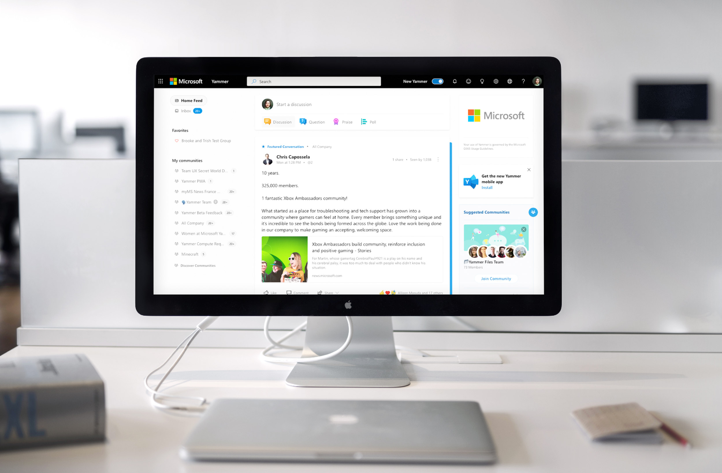
I had the privilege of working with the Microsoft Yammer UX/ Product Design team on the evolution of their newly designed platform. There were many areas of the experience that hadn’t been migrated to the new design system. I helped ship features and update legacy experiences while collaborating with our key partners in other groups including MS Teams, Office 365, OneDrive, SharePoint Outlook and the MS Fluent Design systems team.
Collaboration
I collaborated hosting meetings and providing concepts for file management within our platform marrying functionality from other groups and looking toward the future evolutions of the experiences to provide holistic solutions meeting Yammer user needs that didn’t depart significantly from the forward thinking vision for Office 365. I advocated for the unique needs of our users in these collaboration sessions which resulted in larger groups like the Office 365 team to re-examine their approach to ensure that it scaled appropriately to meet our user needs. We created a hybrid experience embedding some of their file management functionality with our platforms controls, look and feel and categorizations.
Data Driven Design
Our partners in product and data and analytics had already provided first party data, research and analysis that helped us identify the problem. This framed all of our discussions around possible solutions. We knew that users were muting their notifications which was a serious issue because notifications were the primary driver of traffic to our platform.
Native iOS vs Desktop
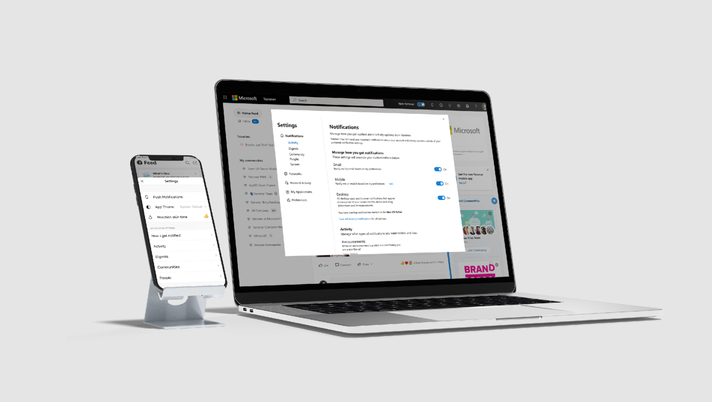
We had first party data that let us know the majority of users were accessing the application through the Yammer native mobile app on iOS. This meant we needed to take a mobile first approach however desktop and mobile did not share a back end or communicate with each other from a systems and architecture standpoint. There was a vision to unify the systems moving forward so I delivered both a near term MVP approach as well as a future forward approach that would show how the systems could work together in the future.
Iterations
We explored many different possible architectures for the application before landing on a direction. We considered offering controls per channel, per type, per category etc. The architecture and technical constraints of the systems heavily influenced our approach and multiple grooming sessions with engineers, architects and product managers was necessary to come up with the right approach. In order to ensure these conversations were valuable I made sure to review the requirements, provide visuals to aid the discussion and call out immediately any difference in approach to ensure each side was listening to each other to make an informed decision as a group moving forward. The visual aids required a lot of iterations to be built out but paid off because we were able to have productive conversations.
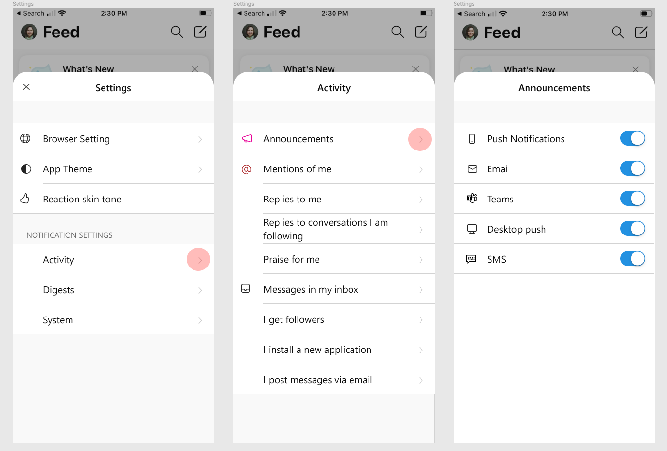
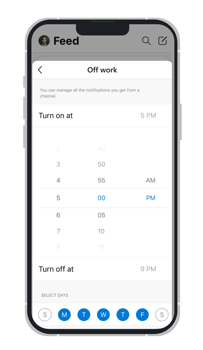
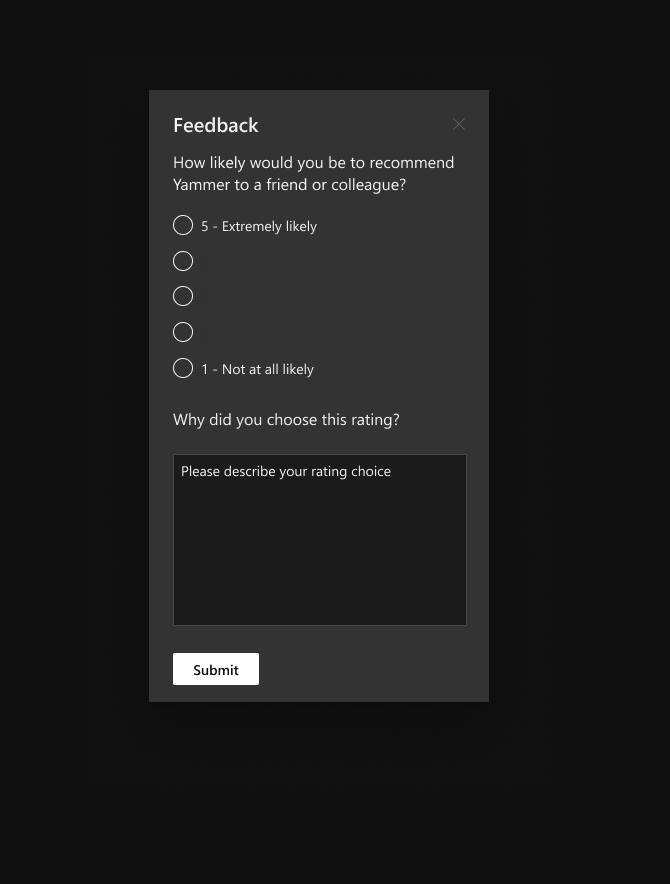
Settings: Notifications
One of the more involved product design challenges I faced was re-imagining Notification Settings for Desktop and native Mobile. Notification Settings were still in the legacy design system and lacked key functionality that was negatively impacting our user engagement including causing users to turn off notifications all together. I worked with engineers, multiple product managers and other design groups to examine the user pain points and come up with a scalable solution. From the data and research gathered kicking off the project it became clear that we needed to educate the users about what they were getting as notifications and allow them the flexibility of being contacted about the content they wanted on the platform they preferred at a time that worked for them. This level of granularity wasn’t possible in the product so we were defining product strategy while developing the user experience.
Strategy - Open Communication
I provided wireframes, then low fidelity and high fidelity prototypes in Figma to illustrate the scalable experience from the most simplistic minimal viable product including paired down functionality to the future vision including multiple platforms, and integrated and parallel mobile and desktop experience as well as a vision for how our notifications could be managed for partner products like MS Teams, Outlook and more.
Having a product manager from Desktop and Native Mobile provided some challenges as their visions weren’t always in alignment. I worked hard to create and open and transparent communication to document and highlight any deltas to come to a resolution and keep the project moving forward. There were many challenges in creating these complex solutions and I was frequently reaching out to design groups as I created new design patterns to try to align with the future vision of MS Fluent (the parent design system) as well as align with MS Team’s Stardust design system which was our key integration partner. The resulting product design solution was a collaboration of many mind imagining and re-imagining how to tackle this complex settings experience and make it feel modern and simple to use.
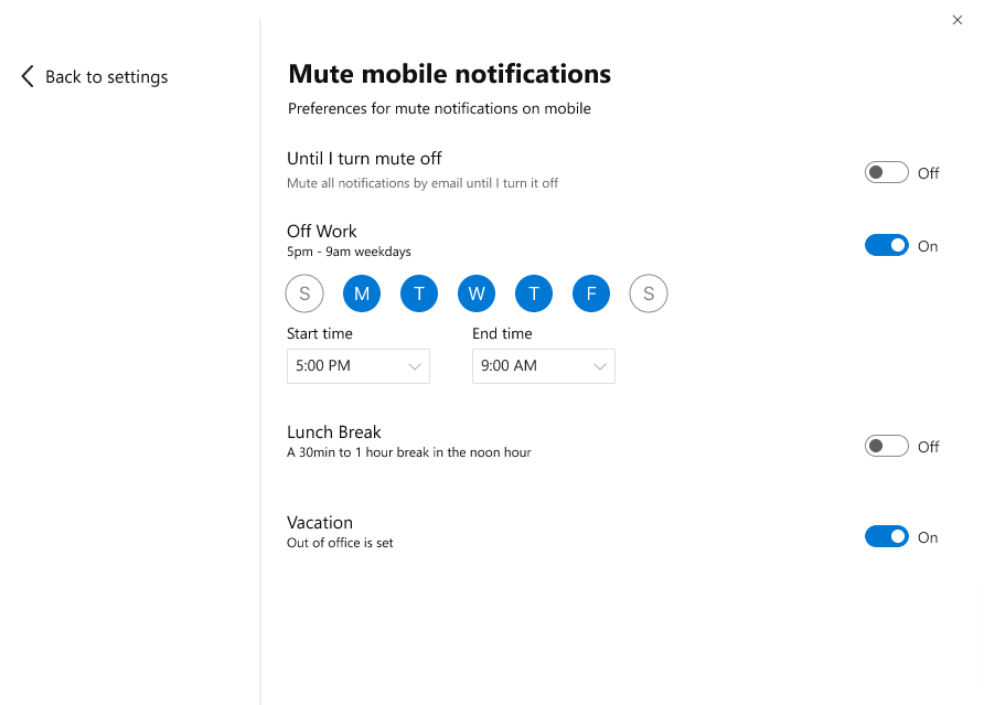
To combat the issue of users turning off their notifications all together to be able to reduce noise we took a dynamic approach that allows users granular control over not only what types of notifications they would like to receive but when they want to receive them. Since Yammer is a unique social media platform associated with work we wanted to provide the ability to pause notifications on a schedule so that employees could reduce the noise in their free time.
Results
I got to present the product design solution for notification settings to the senior leadership team in the Yammer group. This presentation was very well received, having the team recognize the incredible effort to align with our collaboration partners on design and functionality. They were impressed with the attention to detail and the effort to create a visually appealing experience even in a highly functional space like the settings panel. While I wasn’t present for the launch of this feature as I was on a shorter term contract, I was still able to get the project to the point of leadership review, prepped for development hand off. The project was well received and considered for the product roadmap.
Accessibility Work for Yammer Dark Mode
In addition to driving the end to end experience for Notification Settings, I was tasked with exploring our design libraries for dark mode and light mode. We had run into some accessibility concerns so I went through the libraries and designs to audit the issues. Once the issues were identified I met with the developers and the design systems teams to find different approaches to resolving each problem.
Opacity
One issue we had run into was displaying subtle variances of gray using opacity. This way we could extend our base set of neutrals to show even more nuance. Unfortunately opacity is very difficult to make accessible because once you change one color below anything with opacity is now impacted as well in terms of contrast. Our developers requested we change all opacity values of grays into hex values, so I went through and identified these and provided the hex values.
Dark Mode Color
Colors can be difficult to get to pass contrast for accessibility and our application had a few particular brand colors and custom components that needed to be made accessible. One feature was our favorite heart in the sidebar navigation.
The red that we had chosen was not passing contrast and we didn’t have another red to pull from that would work on our dark background. It was my job to modify the dark mode red to ensure it maintained brand integrity, was cohesive with the light mode version and our other brand colors and passed contrast. Though it was a seemingly simple problem it took some iterating to find the right fit for dark mode. Once the correct red was established it was added to our Yammer design system library palette.
Feedback and Iteration
I was sure to provide multiple solutions to problems when exploring feature enhancements and would first bring my design iterations to our team for internal review. We would have review sessions multiple times per week so there was always an opportunity to get an extra pair of eyes on my designs.
Once I had incorporated the feedback from the internal design review I would bring my designs to my product and engineering partners for further discussion. If there was a design direction that was supported by the UX team I would be sure to let my partners know which helped us move quickly knowing designs had been previously reviewed and revised.